Quality
The Quality page of the document is designed to be used for focusing on connection quality monitoring, where you can easily detect any problematic situations just in time. You can open it by clicking the Quality Summary button on the navigation panel of the document.
Quality Summary
Quality Summary displays real-time quality metrics of the monitored hosts. It displays only those hosts the monitoring is currently active for. It is organized with the help of tiles representing the objects being monitored. Let us take a closer look at the data representation.
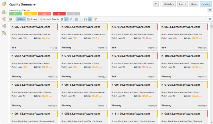
The first mode of Quality Monitor is the per-host connection quality monitoring Pic 1. This is the default mode, where each tile represents a single host. For the hosts that are monitored, the connection quality is calculated based on the rules defined in the program preferences and/or host settings. The tile is filled with red color in case all packets from the sample used to calculate the connection quality are lost, thus the quality is critical. In other cases, the quality value is displayed with the help of the colored tag on the right of the tile: green – for good quality, yellow – for warning, red – for bad, and gray – for pending. In case the host is currently unreachable, thus the quality is represented with the latest reachable one, the tile is hatched.
On the large tiles, you can find the parameters for each host used to calculate the quality and see which parameter is leading to the warning or bad-quality value. The same way as for the state, you can see how long the host connection quality has had this or that value. The smaller the tile the less information is available immediately, but there is still a whole set of values in the tool-tip.
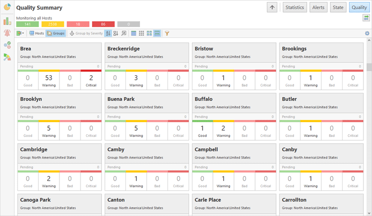
Along with per-host connection quality monitoring, it is possible to monitor connection quality for host groups. The group tile can either represent the group or the set of individual hosts (selected individually or not belonging to any group) Pic 2. The group tile is displaying the number of hosts within the group having specific connection quality. When monitoring connection quality in grouped mode, you can click on the group to focus on hosts from that group, or click on the specific connection quality part within a group to focus on hosts having that specific connection quality.
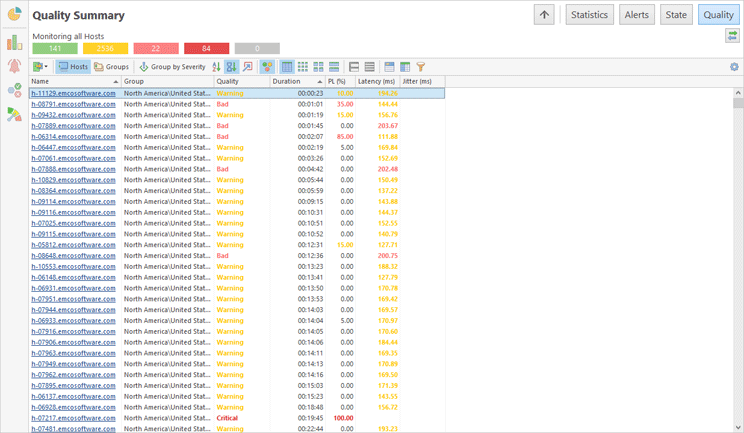
Tiles representation of quality may be helpful for control rooms where all hosts are displayed on a single screen. In other cases you can switch to the data representation as a table. In this case hosts are displayed as table rows and quality metrics are displayed as table columns Pic 3.
You can switch between different modes of Quality Summary using the corresponding buttons on the view toolbar.
Toolbar Overview
|
Export The Export button allows exporting hosts quality information displayed on the screen. |
|
Hosts The Hosts button is used to configure the view for monitoring each host individually. |
|
Groups The Groups button is used to configure the view for monitoring groups of hosts. |
|
Group by Severity The Group by Severity button allows you to group the view the way that the problematic nodes are always displayed on top. |
|
Sort by Name When monitoring hosts, the Sort by Name button enables the view sorting by entry name. |
|
Sort by Time When monitoring hosts, the Sort by Time button enables the view sorting by connection quality change time stamp. |
|
Focus on Problems The Focus on Problems button allows you to configure the view to be automatically scrolled to entries where connection quality goes critical, when grouped by severity and sorted by time. |
|
Highlight The Highlight button is available in the table representation mode only. It turns on coloring of the host quality text in the table, so you can find hosts with the problems easier. |
|
Table The Table button switches the view to the table representation, where each host and its data is represented as a table row. |
|
Small The Small button switches the view to the mode where each monitored host is represented just with a pictogram describing its connection quality. Any other information on the entry is available in the tool tip only. |
|
Medium The Medium button is used to switch to the mode where each entry is represented with a tile containing only the summary information on the entry. The detailed info is available in the tool tip. |
|
Large The Large button enables the view mode where a tile representing each entry contains maximum information on the entry being monitored. |
|
Full Expand The Full Expand button is available in the table mode only. It expands all grouping nodes, if grouping is turned on for the table. |
|
Full Collapse The Full Collapse button is available in the table mode only. It collapses all grouping nodes, if grouping is turned on for the table. |
|
Group By Box The Group by Box button is available in the table mode only. It enables data grouping in the table by the values of the selected columns. When this option is enabled you can drag & drop a column to the appeared area to group data by values of this column. |
|
Choose Columns The Choose Columns button is available in the table mode only. It allows you to select columns that should be displayed or hided on the displayed table. |
|
Filter Editor The Filter Editor button should be used to define the custom filter criteria to be applied to the monitored entries. |
All entries within Quality Summary can be grouped by severity so that the problematic entries are always on top. To enable such grouping, use the Group by Severity button on the toolbar. For example, when enabled, the hosts, that are in the down state, will be displayed on top, then hosts that are in the up state will follow and then there will be the hosts with the pending state.
The Filter Editor button allows you to filter out entries with specific connection quality. To switch between tiles of different size, use the Small, Medium and Large buttons. To display data as a table you use the Table button.
Host Quality
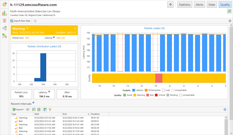
On the Quality Summary page you can click on a host to navigate to the host details. It allows you to review the detailed information for a single host Pic 4.
On the host quality page, in the left top corner you can find the block that is quite similar to the large tile representing the host and contains the same information. Below this block, you can view the information on the distribution for the packets from a sample used to calculate the connection quality. Below the packets distribution, you can find the connection quality characteristics. To the right those latest packets are displayed in the chronological order as well as the connection quality that is reached after each response.
On the bottom on the page you can find the area with recent quality intervals. It is used to display the most recent connection quality intervals that occurred during the last hour.


