Statistics
The Statistics page of a document displays the monitoring statistics for specific periods of time. You can open it by clicking the Statistics Summary button on the navigation panel of the document.
Statistics Summary
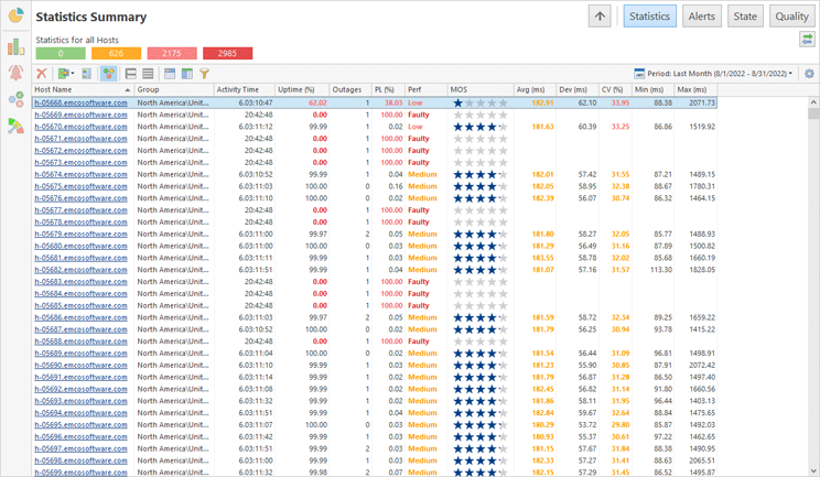
The monitoring statistics summary is represented in a form of a table Pic 1 where each row stands for a single host. The statistics is displayed for the period chosen on the view toolbar. You can choose between live intervals, which are configured on the Monitoring Statistics preference page, a set of predefined historical intervals and custom historical interval. You can apply grouping, sorting and filtering operations for all available hosts at once.
Along with the statistical values, on the Statistics page you can find the performance characteristics, calculated on a basis of these values. The conditions for calculating the performance are provided on the Performance preference page. By default, the performance values are highlighted due to their severity, as well as the values that affect the performance. This behavior is controlled with the Highlight button on the toolbar.
Please note that not all of the available data columns are displayed on this page by default, but you can always choose the columns you really need and remove the unwanted ones by using the column chooser. For example, you can display the Uptime Interval and Downtime Interval columns to see how exactly the uptime percentage was calculated.
For the statistics table, you can choose from the following set of columns.
Column |
Description |
Visible by Default |
|---|---|---|
Host properties |
||
Host Name |
The combination of host address and label provided during host configuration. |
Yes |
Host Address |
The host address. |
No |
Host Label |
The label provided to the host during configuration. |
No |
Group |
The hosts group the current host belongs to. |
Yes |
Activity characteristics |
||
Activity Time |
The time interval during which the monitoring process has been running. |
Yes |
Pause Time |
The time interval during which the monitoring process has been paused. |
No |
Monitoring statistics for the specified interval |
||
Uptime |
The percentage of time with the up state. |
Yes |
Uptime Interval |
The time interval during which the host was up. |
No |
Downtime Interval |
The time interval during which the host was down. |
No |
Outages |
The number of outages. |
Yes |
PL (Packet Loss) |
A ratio of the number of lost packets to the number of packets being sent. |
Yes |
PD (Packet Delivery) |
A ratio of the number of delivered packets to the number of packets being sent. |
No |
Delivered Packets |
The absolute number of delivered packets. |
No |
Lost Packets |
The absolute number of lost packets. |
No |
Dev (Latency Deviation) |
A standard deviation from the average latency value for all round-trip times of packets successfully delivered. |
Yes |
CV (Latency CV) |
A percentage ratio of the latency deviation to the average latency calculated for all round-trip times of packets successfully delivered. |
Yes |
Avg (Average Latency) |
An arithmetic mean for all round-trip times of packets successfully delivered. |
Yes |
Min (Minimum Latency) |
A smallest value from all round-trip times of packets successfully delivered. |
Yes |
Max (Maximum Latency) |
A largest value from all round-trip times of packets successfully delivered. |
Yes |
Performance characteristics |
||
Perf (Performance) |
The performance calculated on a basis of monitoring statistics. |
Yes |
MOS |
A well-established metric to obtain the quality of VoIP on a basis of the latency characteristics and packet loss percentage for all packets sent. |
Yes |
Connection quality characteristics |
||
Good Quality |
The percentage of time with the good connection quality. |
No |
Warning Quality |
The percentage of time with the warning connection quality. |
No |
Bad Quality |
The percentage of time with the bad connection quality. |
No |
Critical Quality |
The percentage of time with the critical connection quality. |
No |
Good Quality Interval |
The time interval during which the connection quality was good. |
No |
Warning Quality Interval |
The time interval during which the connection quality was warning. |
No |
Bad Quality Interval |
The time interval during which the connection quality was bad. |
No |
Critical Quality Interval |
The time interval during which the connection quality was critical. |
No |
You can collapse or expand all the groups using the Full Expand and Full Collapse buttons on the view area toolbar.
Toolbar Overview
|
Period The Period button from the Statistics view toolbar allows you to choose the time period the summary statistics is displayed for. |
|
Delete The Delete button from the Statistics view toolbar is used to delete all monitoring statistics for the selected hosts. |
|
Export The Export button from the Statistics view toolbar is intended to export the displayed monitoring statistics to a CSV file. |
|
Generate Report The Generate Report button from the Statistics view toolbar can be used to generate a monitoring statistics report for the selected hosts, having specified the required report type, output options and a period of time. |
|
Highlight The Highlight button from the Statistics view toolbar enables and disables highlighting the performance cell and cells in the statistics table that affect the performance with the performance mark color. |
|
Full Expand The Full Expand button from the Statistics view toolbar should be used to expand all grouping rows. |
|
Full Collapse The Full Collapse button from the Statistics view toolbar should be used to collapse all grouping rows. |
|
Group By Box The Group By Box button should be used to configure the data grouping for the table within the Statistics view. |
|
Choose Columns The Choose Columns button should be used to choose the columns to be displayed in the table within the Statistics view. |
|
Filter Editor The Filter Editor button should be used to define the custom filter criteria to be applied to the data displayed in the table within the Statistics view. |
|
Advanced Options The Advanced Options button from the Statistics view toolbar opens the view configuration menu where you can reach the settings of storing and displaying monitoring statistics and reset the layout of the view. |
Detailed Statistics
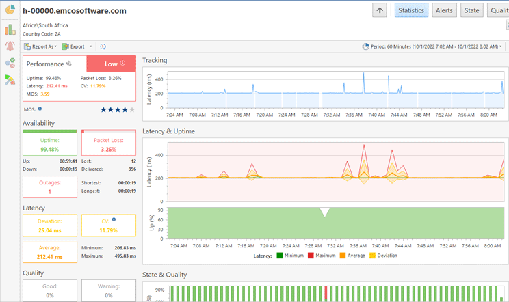
To see detailed statistics for a host you can click the host name in Statistics Summary. The host statistics page Pic 2 is used to provide you with the integral monitoring statistics gathered during the specified period, graphically visualized and grouped by categories. The information on this page is grouped in several categories.
On the toolbar you can find the buttons for selecting statistics display period, opening the detailed timeline, exporting raw data and publishing the statistics report.
Toolbar Overview
|
Period The Period button allows you to choose the time period the detailed statistics is displayed for. |
|
Timeline The Timeline button allows you to open the timeline graph of raw ping responses together with host state and connection quality intervals. |
|
Export Raw Data The Export Raw Data button allows you to export raw ping replies data to a CSV format. |
|
Report As The Report As button can be used to report the detailed monitoring statistics to a PDF, HTML or MHT file. |
|
The Print button should be used to print the displayed monitoring statistics. |
In the left top corner, you can find the performance characteristics. Below the performance characteristics, you can find the information on host availability during the specified interval. It consists of an uptime percentage, uptime and downtime intervals, a packet loss percentage, lost and delivered packets counts and outages information.
The next category to follow is the information on latency: minimum, maximum, average, deviation and coefficient of variation. The next category is showing you the percentage and intervals of different connection quality during the specified period. The last within the left column comes the category, displaying information on monitoring activity – you can find the activity time interval and pause time interval.
On the right side of the page you can find charts with statistical information. The Tracking chart Pic 3 is aimed to display the real-time information with the latest host responses time. This information is displayed only when reviewing live statistics and, in case the selected interval is longer than an hour, only the data for the latest hour is displayed due to performance reasons.
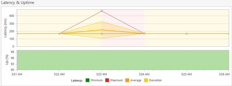
The Latency & Uptime chart Pic 4 is used to focus on the latency and uptime analysis. You can see latency minimum, maximum, average and latency deviation as well as uptime percent. The level of aggregation in the chart is adjusted automatically for the specified period.
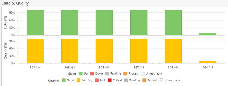
The State & Quality chart Pic 5 is used to focus on the host state and connection quality intervals distribution analysis. It shows a percent of each state and quality values the host had in each of the time intervals. The level of aggregation in the chart is adjusted automatically for the specified period.
The Intervals table displays the list of all host state and quality intervals for the selected period of time. For each state and quality interval you can see its start and end date and duration Pic 6.
The list of intervals is displayed in a form of a tree, where the root nodes represent the specific state. In case the host has been unreachable during any interval, it can be expanded to review when the host was reachable and when not. In case the comment is provided for the interval, it is displayed under the root node. For each interval, along with its type, you can find the start time, end time and duration. In case the interval is exceeding the selected period, the exceeding time is marked with a star.
Toolbar Overview
|
Export The Export button from the toolbar allows you to export the displayed intervals list to a CSV format. |
|
Set Comment The Set Comment button can be used to provide a comment for the selected interval. |
|
State The State button allows you to display state intervals in the table. |
|
Quality The Quality button allows you to display quality intervals in the table. |
|
Full Expand The Full Expand button from the toolbar should be used to expand all nodes in the intervals tree. |
|
Full Collapse The Full Collapse button from the toolbar should be used to collapse all nodes in the intervals tree. |
|
Choose Columns The Choose Columns button should be used to choose the columns to be displayed in the intervals tree. |
|
Filter Editor The Filter Editor button should be used to define the custom filter criteria to be applied to the data displayed in the intervals tree. |
|
Advanced Options The Advanced Options button from the toolbar opens the view configuration menu where you can reset the layout of the view. |
For each state or quality interval, it is possible to provide a comment. The comment can, for example, describe the reason for the outage, or something else. To provide a comment, select the interval and choose the Set Comment item in the pop-up menu or click the corresponding button on the toolbar. The dialog will be displayed on the screen to let you provide the comment. Either the selected or all intervals can be exported to a CSV file using the Export button on the toolbar and the Export All and Export Selected menu items. At any point, you can reset the view layout to defaults using the Reset Layout option from the Advanced Options menu.
The Events table contains all monitoring events for the host and can be used as a monitoring log. If you are facing some problems during monitoring or would like to know when the monitoring process was started and stopped, you should refer to this page.
The events are displayed in a form of a table where each row represents a single event. You can sort, group and filter the events by any column as well as change the columns set. By default the table consists of the event type represented by an icon, the event title, the logging time and the event description itself, with or without a troubleshooting hint. The description and hint for any event is by default wrapped, so that you can easily read it. If you would like to have more events visible at the same time, you can configure the Events page to display only one line per event by disabling the Wrap Description option from the Advanced Options menu. If required, it is possible to add the Error Code column to the view using the Column Chooser.
The following icons are used to display the event types:
|
- |
the blue icon with an 'i' character means that everything is OK; |
|
- |
the brown circle icon with a cross-cut line is used to identify that the operation was canceled by user or due to shutdown of the underlying system; |
|
- |
the yellow icon with an exclamation mark is the warning icon. It means that the special attention should be payed to this event; |
|
- |
the red icon with a white cross is the error sign: it stands for a failure event. |
If required, you can add a column containing the text representation for the severity, that can be used for grouping and filtering data.
Toolbar Overview
|
Export The Export button from the toolbar is intended to export the displayed events to a CSV file. |
|
Full Expand The Full Expand button from the toolbar should be used to expand all the grouping rows in the view. |
|
Full Collapse The Full Collapse button from the toolbar should be used to collapse all the grouping rows in the view. |
|
Group By Box The Group By Box button should be used to configure the data grouping for the Events page. |
|
Choose Columns The Choose Columns button should be used to choose the columns to be displayed on the Events page. |
|
Filter Editor The Filter Editor button should be used to define the custom filter criteria to be applied to the data displayed on the Events page. |
|
Advanced Options The Advanced Options button from the Events page toolbar opens the view configuration menu where you can enable/disable automatic scroll and messages wrapping, and reset the layout of the view. |
If it is really important for you to see the newly arrived events as soon as possible, you can enable the Autoscroll option in the Advanced Options menu. In case this option is enabled, the view will automatically scroll to new events as soon as they arrive.
Using the toolbar or pop-up menu it is also possible to export all or selected events to a CSV file for future analysis, sharing with colleagues or sending problem reports to your ISP.
The layout of the Events page, including all the grouping and sorting settings and the details pane visibility, can be easily reset to factory settings by choosing the Reset Layout option from the Advanced Options menu.
Timeline
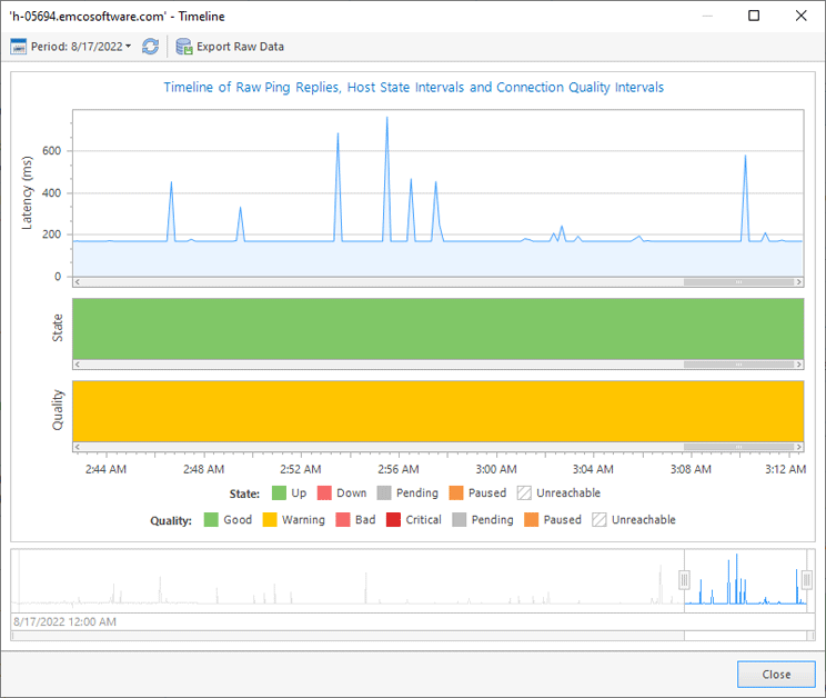
Ping Monitor can show you the timeline of raw ping reply data along with host state and connection quality intervals. You can open the timeline using the Timeline button in the detailed statistics view. You can focus on specific interval of the timeline by clicking the point within Latency & Uptime or State & Quality charts.
Within the Timeline dialog Pic 8, you can find the timeline graph and the sliders to be used for navigation through the timeline. The timeline graph consists of three parts, those are Latency, State and Quality. The Latency part is used to display the ping replies data, the State part reflects the state intervals on the timeline and the Quality part is used for displaying the quality intervals.
Toolbar Overview
|
Period The Period button allows you to choose the interval the timeline is displayed for. |
|
Refresh The Refresh button allows you to actualize the data on raw ping replies, state and connection quality for the specified period. |
|
Export Raw Data The Export Raw Data button allows you to export raw ping replies data to a CSV format. |
Along with using the sliders for navigation, it is also possible to swipe the chart itself for navigation and use mouse wheel for zooming. The timeline range is limited to 30 days due to performance reasons. You can change the timeline range using the Period button on the dialog toolbar. To actualize ping replies data along with state and quality intervals, use the Refresh button on the toolbar. The Export Raw Data button can be used to export raw ping replies data to a CSV format.
