Statistics Page
The Statistics page displays the monitoring statistics for specific periods of time. You can either review the summary statistics for multiple hosts or detailed monitoring statistics for specific host. Let us take a close look at each of the approaches.
Statistics Summary
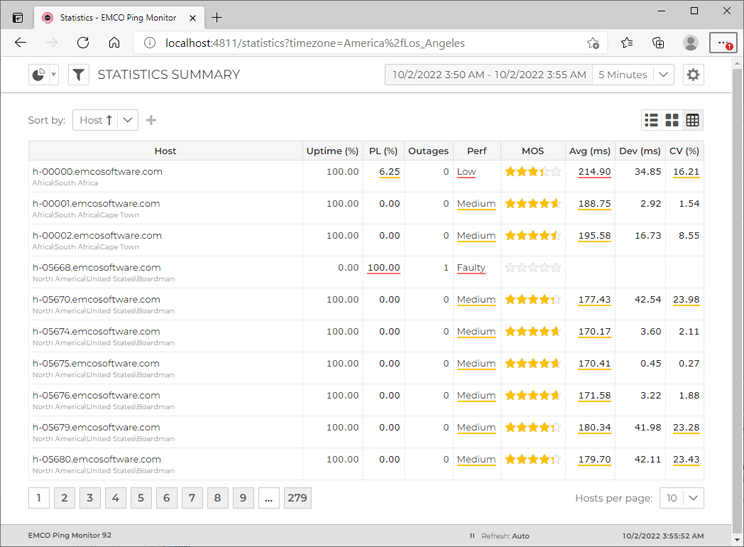
In the monitoring statistics each row or card stands for a single hosts Pic 1. The statistics is displayed for the period chosen in the right part of the page header. You can choose between live intervals, that are configured on the Monitoring Statistics preference page, a set of predefined historical intervals and custom historical interval.
The view data is split to pages. The links for switching between pages as well as the combo specifying the number of entries per page are available in the bottom part of the page.
You can configure the Statistics page to show information only for specific hosts and/or groups using the filter editor that is reached using the Filter button next to the navigation menu in the left top corner of the page. Using the filter editor, you can also filter the page by statistical properties. The refresh interval is configured within the Advanced Options drop-down button from the right top corner.
Along with the statistical values, on the Statistics page you can find the performance characteristics, calculated on a basis of this values. The conditions for calculating the performance are provided on the Performance preference page. The performance values are underlined with color due to their severity, as well as the values that affect the performance.
Toolbar Overview
|
List The List button from the Statistics page toolbar allows you to display the statistics in a form of a list. |
|
Cards The Cards button from the Statistics page toolbar allows you to display the statistics in a form of cards. |
|
Table The Table button from the Statistics page toolbar allows you to display the statistics in a form of a table. |
You can choose between the following representations of statistics summary: list, cards and table. The corresponding buttons are available in the page contents' toolbar. Together with the information displayed, you can find additional summary characteristics, such as periods with different connection quality, in the item tooltip.
Detailed Statistics
With Ping Monitor web interface you can focus on detailed statistics for specific hosts. To reach the detailed statistics, you can click the host name hyper-link in the summary representation. As the result you drill-down to the host level, where you can review all monitoring characteristics of a host.
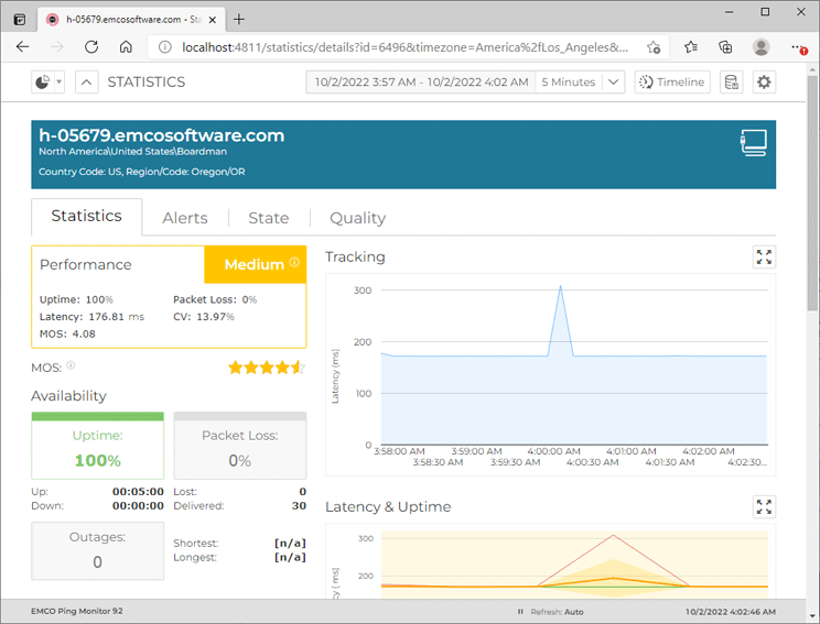
The detailed statistics page for a single host Pic 2 consists of the common host information, such as the host name, label and group the host is located in, displayed on the top of the page and other sections, such as host performance, tracking, latency, uptime, state and quality. Let us take a closer look on each part of the page.
Detailed host statistics is used to provide you with the integral monitoring statistics gathered during the specified period, graphically visualized and grouped by categories. The information on the page is grouped in several categories. In the left top corner, you can find the performance characteristics. Below the performance characteristics, you can find the information on host availability during the specified interval. It consists of an uptime percentage, uptime and downtime intervals, a packet loss percentage, lost and delivered packets counts and outages information.
The next category to follow is the information on latency: minimum, maximum, average, deviation and coefficient of variation. The next category is showing you the percentage and intervals of different connection quality during the specified period. The last category within the left column displaying information on monitoring activity – you can find the activity time interval and pause time interval.
On the right side of the page you can find a few statistics analysis charts. The top chart displays real-time latency tracking. It shows the actual ping statistics. In case the selected interval is longer than an hour, only the data for the latest hour is displayed due to performance reasons. Under the tracking chart you can find the latency and uptime analytics, and the bottom chart displays the analysis information for state and quality intervals. You can click on the points in both charts to open the detailed timeline for the period the point displays integral data for. Also it is possible to expand each chart to full screen using the corresponding button in the chart header Pic 3.
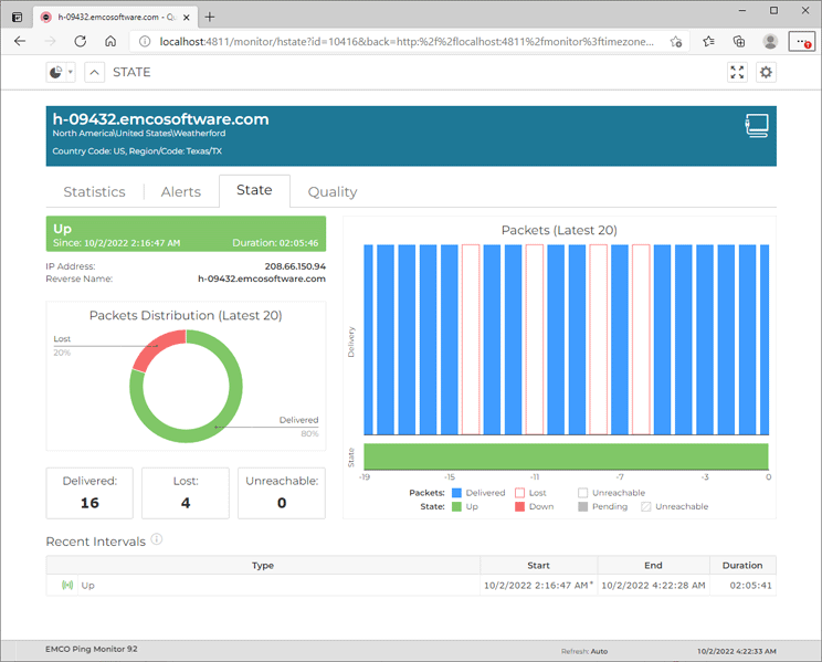
Under the charts you can find a table with the state and quality intervals. By default the table displays the state intervals, but you can switch from state to quality intervals and vice a versa using the buttons located at the top of the table. The table displays the list of all host state intervals for the selected period of time and the list of connection quality intervals. Let us take a closer look at this information Pic 4.
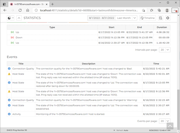
The State Intervals and Quality Intervals tabs are quite similar. The first one displays the list of all host state intervals for the selected period of time and the second one – the list of connection quality intervals. Let us take a closer look at these tabs using the State Intervals one as the reference Pic 5. The list of intervals is displayed in a form of a tree, where the root nodes represent the specific state, and is split into pages. In case the host has been unreachable during any interval, it can be expanded to review when the host was reachable and when not. In case the comment is provided for the interval, it is displayed in root node and spanned through the child nodes, when expanded. For each interval, along with its type, you can find the start time, end time and duration. In case the interval is exceeding the selected period, the exceeding time is marked with a star. You can use the buttons above the table to display only the intervals of the specified types.
At the bottom of the page you can find a list of host events. It contains all monitoring events for the host and can be used as a monitoring log. The events are displayed in a form of a table where each row represents a single event, split into pages.
If you are facing some problems during monitoring or would like to know when the monitoring process was started and stopped, you should refer to this table.
Timeline
Ping Monitor can show you the timeline of raw ping reply data along with host state and connection quality intervals. You can open the timeline using the Timeline button in the header of the detailed statistics page. You can focus on specific interval of the timeline by clicking the point within Latency & Uptime or State & Quality charts.
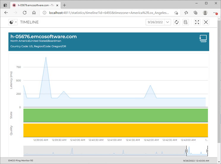
On the Timeline page Pic 6, you can find the timeline graph and the sliders to be used for navigation through the timeline. The timeline graph consists of three parts, those are Latency, State and Quality. The Latency part is used to display the ping replies data, the State part reflects the state intervals on the timeline and the Quality part is used for displaying the quality intervals.
The timeline range is limited to 30 days due to performance reasons. You can change the timeline range using the period combo in the page header. To actualize ping replies data along with state and quality intervals, use the Refresh button from the header. The Export Raw Data button can be used to export raw ping replies data to a CSV format, and the Full Screen button allows you to expand the time line to full screen.
