Analyzing Hosts Statistics
The program allows you to access the detailed monitoring statistics for any host. While the host state and the connection quality are real-time characteristics, the statistics allows you to analyze the host metrics and performance during any historical period.
When working with historical data, it's important to remember that the result depends on the selected period. In other words, statistics is always reported for a particular period. For example, the uptime metrics for yesterday and for the previous week will be different, so you need to select the required period first to work with statistical data.
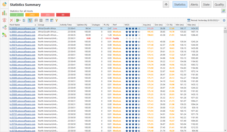
Statistical data for all hosts collected by the program is available in the Statistics Summary page Pic 1. Click the corresponding button on the navigation panel to open Statistics Summary. First, you need to select the required period in the corresponding combo-box located on the view's toolbar.
The Statistics Summary page shows general data for all the hosts during a selected period, so that you can see what the uptime, the packet loss, the latency, the number of outages and other values are for every monitored host. The host statistics is displayed as a table, so you can sort and filter the displayed data, reorganize the displayed columns and use other standard features available for any grid view.
Reviewing Host Statistics
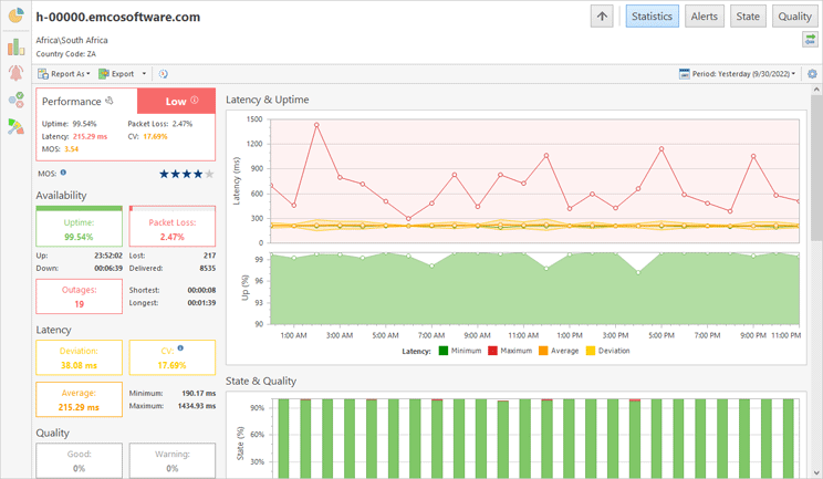
The Statistics Summary page shows data for all the hosts. To see the statistics for a particular host, you can click on its name to drill-down to the selected host Pic 2. The host statistics is displayed for a specific period selected in the header of the view.
The host statistics shows how various metrics change over time. The program displays aggregated information on charts, so that you can track the latency, uptime, state and quality changes. The program reports the number of detected outages and the time intervals during which the host had different state and quality characteristics.
Estimating Historical Host Performance
The host state and quality are real-time characteristics that constantly change. For example, the host quality may change many times during a day, so if we need to estimate the host performance for the entire day, we cannot use quality. For estimating the host performance during a historical period, we can use other metrics such as the uptime percentage, packet loss percentage, average latency, latency deviation, latency coefficient of variation (CV) and mean opinion score (MOS) calculated for the entire period.
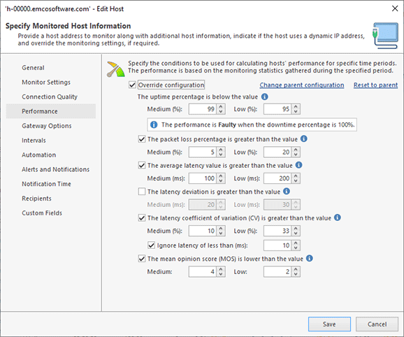
To estimate the host performance, the program calculates metrics for the selected period and compares the metrics with the defined thresholds. For example, using the default settings, the host performance is considered as High if the uptime exceeds 99%, Medium if it is over 95% or Low if it is below 95%. Other metrics have different thresholds, for example, the host performance is considered as High if the packet loss is below 5%, Medium if it's below 20% and Low if it exceeds 20%. The program analyzes the metrics and sets the performance rank for the host as the lowest rank of all the metrics. The overall host performance during the selected time interval is displayed in Statistics, and the metrics that are considered Medium and Low, are highlighted, so that you can easily understand what the actual performance rank set for the host is based on.
If required, you can tune the thresholds used to estimate the host performance on the Performance page of the program preferences. Those settings are applied to all the hosts, but it is possible to override the common settings and specify custom settings for a host or group Pic 3.
Host performance can be considered as the aggregate of all the metrics during a specific period. For example, when analyzing a weekly host performance, you may look into the daily host performance and see how it changed over time. It allows you to find the days when the performance was Low and check the detailed statistics for those days to identify the reason of the problem.
Reviewing Ping Data on the Timeline
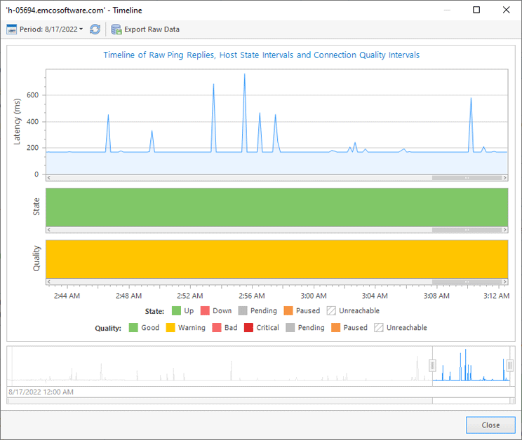
The program stores all collected ping data, which allows you to see the latency chart for any host and any period. To open the timeline, click the on the Timeline button located on the header of the Statistics view displaying a host. The Timeline view allows you to choose the time range to be displayed on the chart, using the range selector located at the bottom. At the top, you can see charts showing the ping latency and the host state and quality during the selected period Pic 4.
When reviewing data displayed in the Statistics view, you can click on values represented in the charts to open Timeline for a specific time range. For example, when reviewing statistics for a day, you can see data aggregated by hours in the Latency & Uptime and State & Quality charts. You can click on any hour value displayed in the charts to see pings for that hour in the Timeline view.
In the Timeline view, you can see the results of every ping sent to the monitored host. To see the latency value, read the data displayed in the tooltip that appears when you hover the mouse pointer over the chart. It is possible to export the ping data displayed in the Timeline view by clicking on the Export Raw Data button. The ping results are exported as a CSV file that can be opened in external programs.
Practical Examples of Using Statistics
How to use statistics to find and analyze problems? For example, we need to analyze the network outages that happened yesterday to find problematic hosts. So how can we use the program in this case?
In this task, we need to analyze data in the historical period and work with statistics that is available in Statistics Summary. We need to analyze the data for yesterday, so we should select this period. As a result, we can see the statistics of all the hosts for yesterday displayed as a table. How can we find problematic hosts? There are multiple approaches to this, and we can use one depending on our needs.
For example, we can sort the displayed data by the Perf (i.e. performance) column, so the hosts with a Low performance are displayed at the top, and we can easily find problematic hosts. It is helpful, but it isn’t sufficient, because hosts with a Low performance can have no outages (some hosts have a high latency, so they show a Low performance, but they work stably and with no outages). So how can we find hosts with outages?
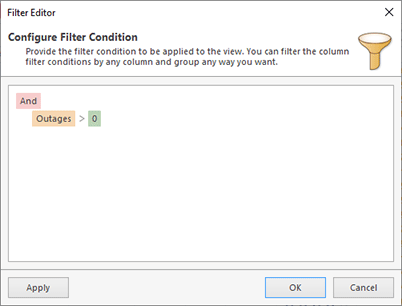
To show the hosts with at least one outage that took place yesterday, we can use a filter. When we press the Filter Editor button on the toolbar, the editor appears and we can specify a filter condition Pic 5. After the filter is applied, the displayed data change and we can see only hosts with outages.
If you apply a filter, it is saved until you reset it. The current filter condition is displayed at the bottom of the grid. To reset the filter and display all the hosts, you need to click on the Close button located to the left of the filter.
After applying the filter, we can see all the problematic hosts and start to analyze them one by one. The hosts with the maximum number of outages should be analyzed first, so we can sort the displayed data by the Outages column and click on the host displayed at the top to open its statistics.
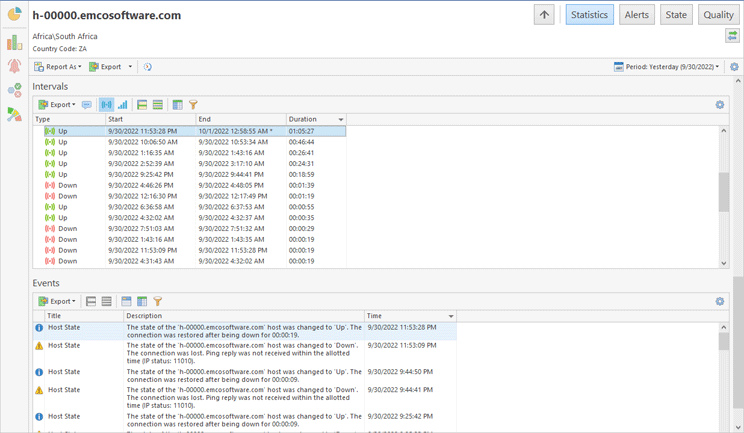
To analyze the host statistics, first we need to know when the outages happened. Therefore, we can scroll down to the Intervals table and switch it to display state intervals. It shows a list of host state intervals detected during yesterday, but we need to analyze the Down intervals only, so a corresponding filter should be applied. As a result, we can only see the Down intervals and their start and end time and duration. We can sort the displayed data by duration to display the longest outages at the top of the list Pic 6.
To get detailed information on the host performance, we can review the Latency & Uptime chart to see how the host metrics changed during the day. Note that the latency chart shows the host performance as highlighted backgrounds, so if the host performance was Low during a particular time interval, you can see that it is highlighted with a red background on the chart. You can hover the mouse pointer over the chart to see the latency minimum, maximum, average and deviation displayed for every hour.
The latency, uptime, state and quality charts in Statistics show aggregate metrics. In particular, when we check the statistics for yesterday, the displayed data is aggregated by hours. It helps you to identify the hour when the problem happened and drill-down to see detailed information for this hour. For example, the State & Quality chart displays hourly quality values, so we can easily find the hour when the quality was Bad. It is possible to click on this chart value for the program to open Timeline for the selected hour, so that you can see all the ping results during that hour.
